Despite the title, this post will, for reasons that will become apparent, report on the fonts at both Edburton and Pyecombe. Though not quite identical twins, they are certainly sisters of nearly the same age. John Allen remarks that the one at St. Andrew’s is “the earliest datable object in the church”. Indeed it may even be older than the church itself. When churches were rebuilt, the font was often retained for use in the replacement building.
Both the Edburton and Pyecombe fonts are made of lead. This is very uncommon. Of the tens of thousands of fonts that existed in England in 1909, just thirty were made of lead.
The greatest enemy of lead fonts, as of all lead objects, has been the intrinsic value of the material. The discarded stone font makes a convenient trough for watering animals, or will pleasantly decorate the parsonage garden when used as a flower-pot, but the lead font has higher uses. It can be turned into many bullets. [Weaver 1909, page 1]
At the time Weaver was writing, Sussex provided a home to four lead fonts, at Parham and Greatham House in Pulborough in addition to the two considered here. The Parham and Pulborough fonts are not siblings to those at Edburton and Pyecombe. The Parham font is fourteenth century and has a unique design that relies on lettering for decoration [ibid. page 20]. The Pulborough font is (or was) rectangular with minimal ornamentation and “nothing by way of date can be hazarded, for it is a simple unassuming thing and reveals nothing” and “has fallen to the low estate of a flower-pot” [ibid. pages 20-21].
By contrast:
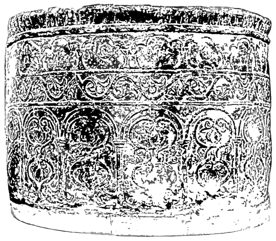
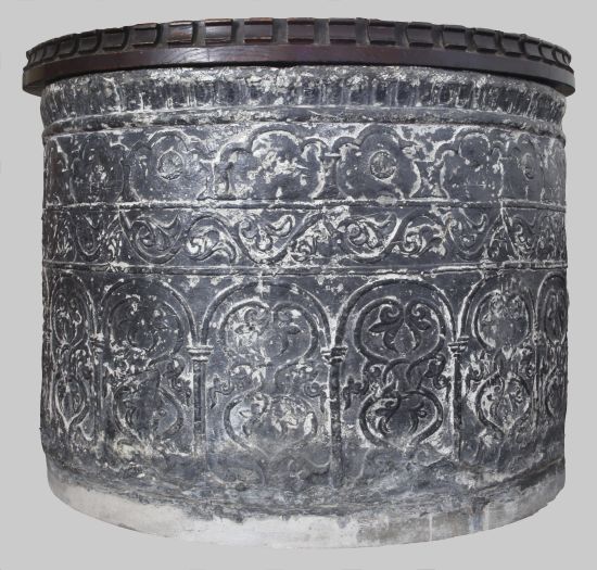
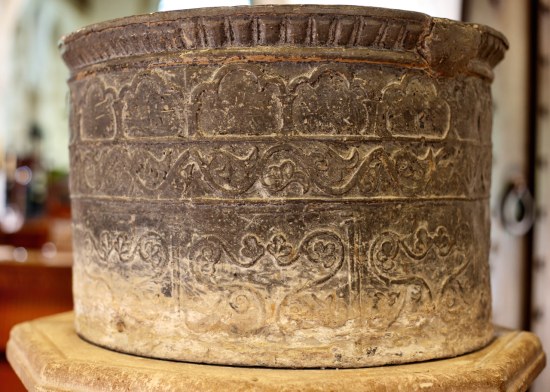
The Edburton and Pyecombe fonts help to keep up the high archaeological reputation of Sussex. They lack figures altogether, and are probably the work of a Norman plumber of about 1200 or later. Both fonts have the heavy fluted rim, the upper arcading and the narrow middle band of scrollwork, but there is no slavish likeness in detail or size. The lowest band differs in the two, the Pyecombe font having an arcading of fifteen, with floral work within the arches the Edburton example shows the scrolls without the arches.
The Pyecombe bowl is 6 feet in circumference and 15 inches deep, that of Edburton is 5 feet and 13½ inches respectively. Though distinctively Norman in character, the coming of Gothic is apparent in the trefoil heads of the upper arcading. The general effect is perhaps a little suggestive of embroidery, but very successful. [Weaver 1909, pages 14-15.]
The external circumference of the Edburton font is actually 5 feet 2 inches around the body. The circumference around the rim is about 5 inches more.
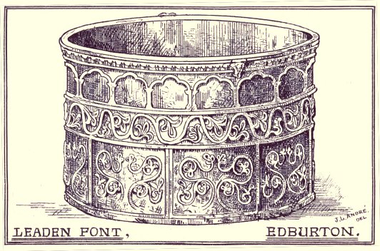
Like Weaver, André dates both fonts to the late Norman period. He also has much useful information about their construction and design.
Leaden fonts were, from the flexible nature of their material, most easily and readily fashioned into a circular or tub-shaped form, and many of them are therefore of this outline, being, in fact, short cylinders .. In each example I have seen in situ, or know of by means of descriptions or drawings, the bowl alone is of metal, placed upon a stem or base of stone or brick. The majority of those of the Norman era have foliage work twining about the surface, or small figures under a continuous range of arches. .. Llancourt and Tidenham, in Gloucestershire, have fonts with patterns on them, evidently cast in the same mould, as is probably the case with portions of those at Edburton and Pyecombe.
The method employed in making these vessels was apparently first to cast them flat, afterwards bend them into the required circular form, and then solder them up, the edges which have been so joined are clearly seen on the bowls at Edburton and Pyecombe, where the patternsare ‘botched’ or mutilated by it. On some examples the figures and ornaments are fac similies, many times repeated on the same work, and it is most likely in these cases that a single one was first carved out of wood, and then impressed on sand as often as required to complete the entire design. All the Sussex specimens would appear to be thus formed, and the practice was a common one in the cast-iron works of the South of England, many Sussex fire-backs being composed of a shield or monagram, repeated at intervals over the surface. .. [T]wo of the specimens of metal fonts in Sussex are evidently in great part moulded from the same pattern, the whole of the upper portions of the bowls at Edburton and Pyecombe being precisely similar in design; the latter, I am inclined to think, the oldest of the two. It is now placed on a modern circular stem, and measures 23½ inches across the outside of the cornice 22 inches inside diameter, the depth of the outer face is 15 inches, and inside the bowl 13¾ inches; the design is divided into four horizontal bands of ornament surrounding the cylindrical basin, the lowest is composed of fifteen circular-headed arches on moulded caps and thin flat pilasters, within each compartment so formed is a pattern of peculiar character, but by no means inelegant, it has a central ring through which foliage scrollwork is interlaced, over this is a band of continuous floriated ornament, with leaves above and below an undulating scroll, all the upper foliage being alike, but the lower, formed of two alternate patterns; above this is an arcade of nineteen trefoil arches of a purely Early English motif, the whole composition being finished with a cornice formed of a series of members similar to those of a cushion capital of Norman date. The upper range of arches at Pyecombe has on the alternate bays small circular bosses which are wanting at Edburton.
Here the bowl is also on a new base, of a more elaborate character than the one at Pyecombe; it differs from the latter in the composition of the lowest range of the four circles of ornamentation; here instead of an arcade is a series of square panels enclosing scroll and foliage work of an almost Early English type, and on the cornice are small projections or brackets opposite each other, which may have held the staples of the flat font-cover such as was then usually employed, canopied covers originating in the Perpendicular Period of Gothic art. The size of the basin is rather less than that of the first example, being 21½ inches extreme outside diameter and 19 inches that of the inside of the bowl, the height is 13¾ inches and the inside depth 13 inches.
This post is wholly based on the works of André and Weaver cited below:
- J. Lewis André (1882) Leaden fonts in Sussex. Sussex Archaeological Collections XXXII, pages 75-80.
- Lawrence Weaver (1909) English Leadwork: Its Art & History. London: Batsford.
You can inspect both the Edburton and Pyecombe fonts on the same day: it is a walk of about five miles from church to church over the Downs via the Dyke and Saddlescombe.

Currently popular local history posts:


